MA — Brand Identity and Website Design

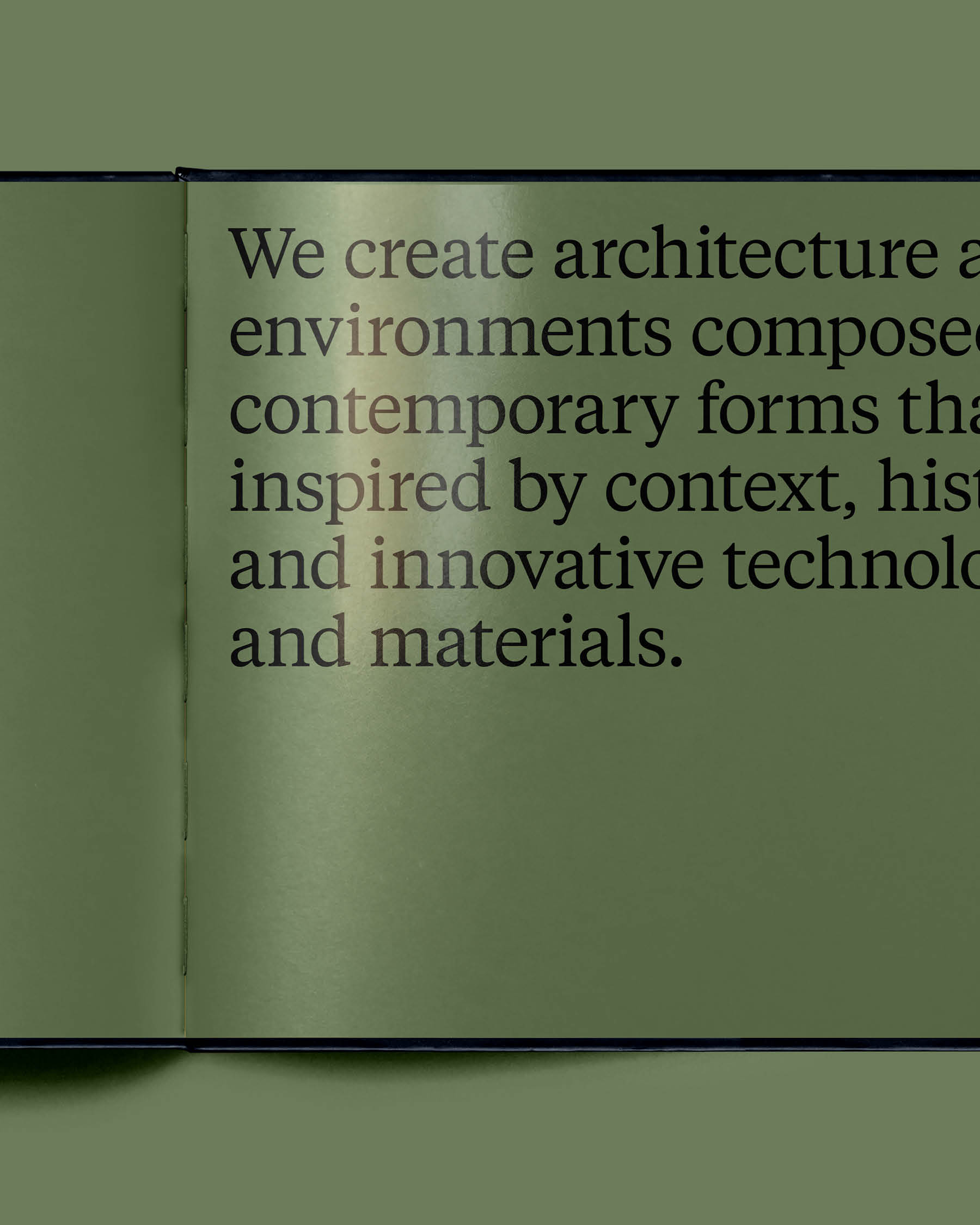
MA is a multidisciplinary, studio-based practice recognized for its creative use of new materials and technologies, sophisticated, sustainable designs, and thoughtful engagement with the arts.

Over the past year, we had the privilege of working closely with Morris Adjmi and the MA team to reimagine their visual identity and digital experience... (read more)

Reimagining the digital identity design for MA

MA is a multidisciplinary, studio-based practice recognized for its creative use of new materials and technologies, sophisticated, sustainable designs, and thoughtful engagement with the arts.

Over the past year, we had the privilege of collaborating closely with Morris Adjmi and the MA team to reimagine their visual identity and digital identity design for an enhanced digital experience. Our involvement included the implementation of our web design packages and branding and identity design services.

Inspired by a classic serif and modernized through subtle customization, the new MA ligature strikes a balance between practicality and elegance. The unity of the letterforms serves as a tribute to the firm's evolution, seamlessly connecting to the past, present, and future.

In addition to the revamped visual identity, we provided innovative web design ideas and created a new website that showcases the full suite of design assets. This includes a robust hardworking typography system and a color palette that exudes confident while remaining respectful to the content it presents.

Featured on: Awwwards and Essential Design.

Morris Adjmi Architects - Website Design

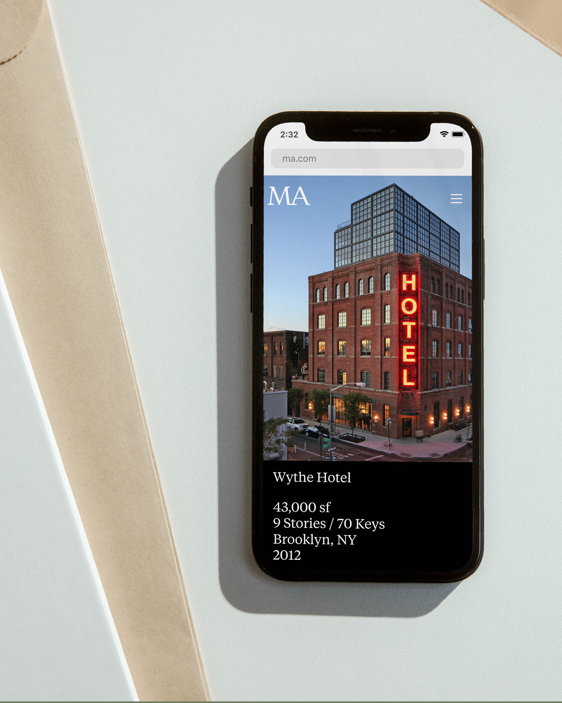
Morris Adjmi Architects - Responsive Mobile Design

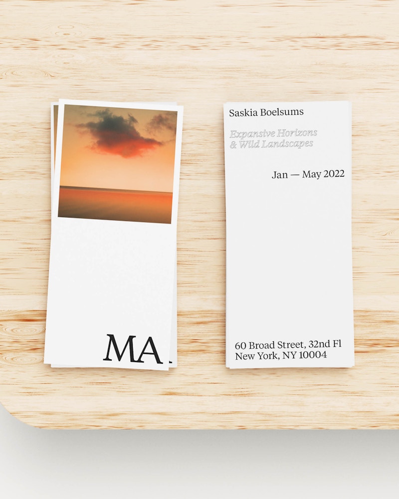
Morris Adjmi Architects - Collateral Design

Understanding Audience and Empathic Design

Digital design projects require an abundance of critical thinking, as we look to solve a series of problems and answer essential questions throughout the process, all for our users.... (read more)

Starting point in design: Understanding your audience needs

In the field of medicine, the doctor/patient relationship is seemingly straightforward, with a clear path for success. The physician's job is to understand their patient's condition, prescribe the best possible therapy, and evolve that therapy over time based on the results. But the starting point is the key. If the doctor doesn't take the time to understand the individual needs of their patient and instead makes assumptions regarding that need, the result will be less successful at best and catastrophic at worst (see: malpractice). Designing a digital product requires a similar approach to understanding your audience through empathic design research. As technology evolves daily, and user needs change rapidly, digital design projects demand heightened critical thinking.


Essential questions in design research

Throughout the process, we address problems and answer key questions to diagnose solutions effectively.

So what are these essential questions? While there are many, three questions rise to the top and must be adequately answered before all others, no matter the specifics of the project at hand:

  1. Who is this for?
    The User - the people we're collectively trying to engage.
  2. What needs to be communicated?
    The Message - our mission and value proposition.
  3. What's the best delivery method?
    The Experience - the journey we're taking the user on by way of design.

Keeping the user and their needs at the center of the design process may seem obvious, but it is often forgotten, resulting in a series of uninformed decisions based on personal preference. While our personal taste is an acceptable starting point, it cannot be the finish line because brands exist for their customers.

Your users are real individuals, so we must do our best to understand the target audience and their needs. Rather than making assumptions, an empathic design approach dictates how we effectively communicate with our audience. As strategists, designers, and technologists, it is our responsibility to understand the unique requirements of those on the other side of the screen and create for them.

So how do we measure the success of a user-centric approach if we're not in the same room as our users, performing focus groups and consumer testing? In part, we now have analysis tools at our disposal to help in this process. By reviewing metrics such as engagement rates, average visit length, unique page views, heatmaps, and more, we can limit assumptions while gaining a deeper understanding of our user's behavior. This data collectively shows us the aspects of our design that are successful, as well as those areas that need to evolve.

Examples of design elements that can have a significant impact on user behavior include:

  • High quality, properly positioned content
  • Considered typography
  • Visual cadence / whitespace
  • Intuitive navigation
  • Macro animations
  • Page transitions / snappy load times
  • ...and more


Designing with empathy

Websites and digital products are living things that must evolve to remain relevant. Thanks to these insights, we can now leverage data over time to continually refine the experience for our users, watching and learning from their interaction in real-time. We refer to this process as adaptive design. It is an exhaustive pursuit that keeps our user's needs at the forefront, all the while ensuring more success for the brand itself.

Bunsa Studio — Brand Identity and Website Design

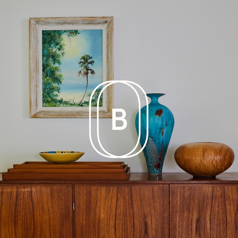
We were recently commissioned by Miami-based interior design studio Bunsa to reimagine their visual identity and digital portfolio experience. With an impressive project list and well-deserved recognition throughout the industry, the firm was in need of a brand presence that lived up to the work they put into the world.

As we gained an understanding of their culture and approach to interior design, we sought to create an identity system that was bold, colorful, and simple, with a wordmark rooted in a Bauhaus typestyle. The identity then led to the design and development of their new website, which places an emphasis on their impressive body of work through large imagery and immersive layouts. Finally, we implemented Craft CMS – a modern, headless content management system – enabling the Bunsa team to manage all of their content with ease.

View website: Bunsa.Studio

Featured on: Awwwards, SiteInspire, Minimal Gallery, and Godly.

Brand identity and website design for Bunsa Studio


In a recent collaboration, Miami-based interior design studio Bunsa engaged us to reimaging their brand visual identity and elevate their digital portfolio experience. With an impressive project list and industry recognition, the firm needed a brand presence that lived up to the caliber of their work, and our brand identity design services delivered just that.
 
Understanding their culture and approach to interior design, coupled with our web design and development expertise, we sought to create an identity system that was bold, colorful, and simple, with a wordmark rooted in a Bauhaus typestyle. This identity extended to the design and development of their new website, emphasizing their impressive portfolio through large imagery and immersive layouts. Finally, we implemented Craft CMS – a modern, headless web content management system – enabling the Bunsa team to manage all of their content with ease.

Featured on: Awwwards, SiteInspire, Minimal Gallery, and Godly.

Trust the Process

When communicating the need for process in the practice of design, what can be learned from the approach of an NBA franchise?... (read more)

Trust the process: Digital Design and Brand Creation


In 2013, the Philadelphia 76ers were stuck in a rut. They were a below-average team embroiled in a culture of mediocrity, so they began a massive overhaul that started with the hiring of a new general manager, Sam Hinkie.

Hinkie's method was ... different. He immediately began to emphasize his belief in process:
 
A focus on long-term success over short-term wins.
 
While that sounds good in theory, in sports, short-term losses feel like long-term losses, and after the first two seasons led by Hinkie, the team had reached an all-time low. So why did Philadelphia stand behind the new method?

They had trust in the process.

Despite the 76ers having the worst record in the NBA. Despite Hinkie being eventually fired (technically he resigned). Philly stuck it out. They understood that time would bring long-term success (the 76ers are now considered a top-three team in the Eastern Conference), and it is time that we are here to talk about.

Our culture in the west is seemingly obsessed with the idea of moving quickly, and the speed we try to bring to most endeavors appears to be the new normal. We all seem to be in one, massive hurry. But should we be? Specifically, in the practice of design and digital design process, can quality creative work be achieved when the primary motivator is "Let's get it done ASAP" rather than "Let's take the time to make this great?" Is it possible to arrive at a lasting creative solution in a rush?

When approached about a new project, we're often asked: "How long will this take?" It's a logical question. As a brand creation agency, our creative teams approach new projects in different ways and tend to answer this question differently based on their size and capabilities. Moreover, it's natural to want to confirm the proposal with the shortest timeline to arrive at a finished product quickly.

But despite this totally normal tendency, we believe that as a forward-thinking agency (no pun intended), we often need to buck certain trends. And one of the ways we do this is simply by trusting our process.

In our years of providing brand creation services, we've developed a method that consistently yields successful across diverse market sectors and challenges. This approach is adaptable to accommodate the specific needs and goals of various projects while continually evolving. Regardless of the scenario, the undeniable truth remains: success requires time.

In the practice of design and brand creation, moving as quickly as possible generally means the results will be inferior in both quality and integrity. Taking shortcuts requires skipping necessary research, planning, and creative exploration. Instead of understanding the need and creating something with the good of the end-user in mind, we create something we think is cool and that's simply not enough anymore. Shortcuts also result in less time to develop the emotional investment needed to take a product from being liked to being loved (and sold).

To create something significant and successful, we need to understand what we're doing, why we're doing it, and who we're doing it for. And we need to value long-term results over short-term gratification.

In other words, we need to trust the process.
Thanks for the inspiration, Hinkie.
Amanda Martocchio Architecture — Identity and Website Design

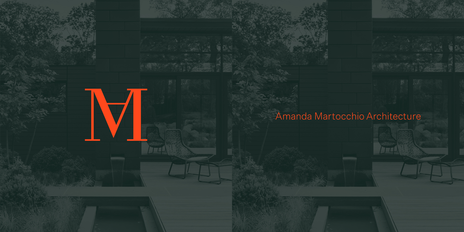
Amanda Martocchio Architecture came to us as a well-established practice looking to reimagine their identity and online experience. We listened and learned as their team unpacked where they'd been in the past, their goals for the future, and the clients they serve. Taking an approach that puts the user first, we sought to create a modern identity system with a nod to the past, while maintaining the focus on their work with limited friction and fewer clicks. Featured on Awwwards and Site Inspire.

View Website

Website design for Amanda Martocchio Architecture


Amanda Martocchio Architecture, a well-established practice, sought our expertise for website design services to reimage their brand identity design and web experience. Listening and learning from their team's insights on their history, future goals and client base. We adopted a user-centric approach, we aimed to create a modern brand identity system, blending elements from the past, while prioritizing their work with minimal friction and fewer clicks for a seamless user experience.

Featured on Awwwards and Site Inspire.

Beware of Copycat Branding

We've all seen them. They're everywhere. The primary colors, geometric-sans typography, and cutesy character illustrations...... (read more)

Crafting Authenticity: Beyond copycat branding

 
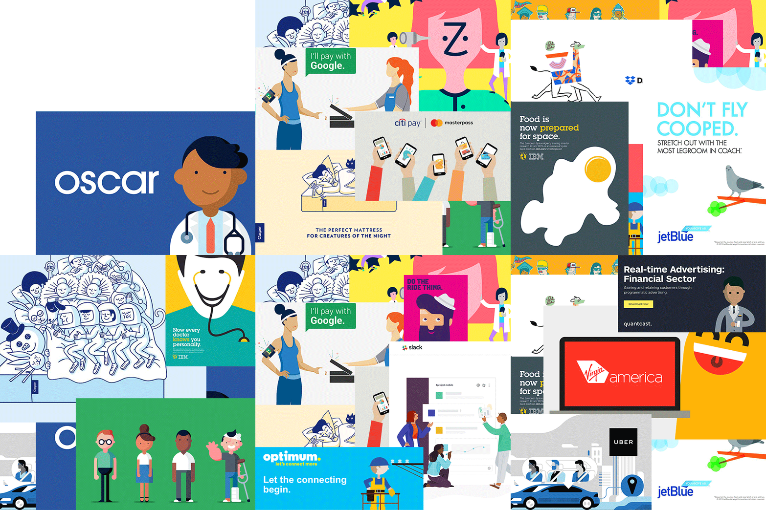
We've all seen them. They're everywhere. The primary colors, geometric-sans typography, and cutesy character illustrations.

The goal would seem to be reducing "noise" through a minimal design aesthetic that foregoes gradients, stylized fonts, and drop shadows by way of simple layouts with ample white space. And it's a trend that follows us, seemingly everywhere we go.

Trends are a challenging thing. Everyone wants to start them and no one wants to follow them, yet most of us find ourselves doing the latter. A trend is a general direction in which something is developing or changing. When that new direction materializes, it can be hard to stay away, particularly when it appears to be successful.

Brands are tempted by following trends all the time. Why? Because brands are made up of people — people that are faced with the direction their competition takes and what their industry is doing as a whole — and the more we take in, the more it influences us. But should we follow a trend purely because it seems favorable? Is this the road to "success"?
It seems we all know, deep down, the answer is no. And yet we seem to follow trends anyway, as it's the path of least resistance.
 
But the reality is, nothing of lasting value ever came from taking the easy road.

We see this imitation all the time in the world of advertising. It's tough to say who started it (was it Casper? was it Oscar? was it...?) and it may have been the right direction for the trend-setter at that moment. But now it seems that everywhere you turn, everyone is doing the same thing. A deluge of colorful, adolescent, hand-drawn brand identities with no unique personality.
No soul.


Our brand identity design process

In our brand identity design process, rather than merely adding to this noise, we strive to work through a thoughtful method that guides brands in discovering their true identity. Why? Because a brand, fundamentally, should be genuine and true to its essence. Our branding process has been meticulously crafted to establish the tone of voice, visual identity, messaging, website, and all core components necessary to craft a unique identity design. Our approach ensures that these elements are not borrowed or heavily influenced by other brands. The brand should be genuine to the actual personality of the organization itself and the individuals within it.

Achieving this demands effort, time and a systematic process. We prioritize listening, strategizing, and designing in sequence to unveil a brand's authentic personality. 
 
And perhaps, therein lies the answer to the challenge of trends. If we can prioritize listening over talking and learning over assuming and process over pace, then maybe – just maybe – we can start a trend instead of following one.
You Are Not A Template

Generic products can sometimes do the job — assuming the ingredients are comparable at a lower price point. But is what's true for sunscreen also true for websites?... (read more)

Custom websites VS templates

 
Generic products can sometimes do the job — assuming the ingredients are comparable at a lower price point. But is what's true for consumer goods also true for your brand's digital presence?

In a time where the number of "template" website providers seems endless (Wix, Squarespace, Jimdo, Weebly, Shopify, Godaddy, Wordpress, Moonfruit, Pixpa, MoPro...the list goes on), it’s tempting to wade into the world of web design the same way you’d shop at Target. After all, these services claim to offer the convenience of creating a digital presence without the need of a design agency and programming team, all at a low-cost.

Templates can be a passable solution when you're just starting out. But once your brand has matured, it’s time to invest in your web presence in a way that communicates the same pride you would when speaking about the venture you’ve built. Now more than ever, your website is your brand's public "face." It's often the first interaction people will have with your company and your one shot at making a lasting impression.

So the question is, do you want to leave that critical moment to a generic template?

People often ask us about what the differences between custom web design and website templates – why a custom-designed website is more valuable than one created using an off-the-shelf solution. Our answer is frequently the house analogy. A custom website vs. a template is similar to the difference between a pre-designed home and one designed specifically for you. With the former, you’re trying to fit your needs into someone else’s vision (hoping that maybe, just maybe, the layout will work with your lifestyle and needs), often experiencing all the frustrations that doing it backward entails. But with a custom-designed home, all of your needs and desires are considered first, and the design, layout, structure, and materials are then chosen to fit those needs perfectly (presuming you’re working with a great architect!).

The same can be said of a template website vs. a custom-designed solution. With a pre-designed site, you are taking a user experience and interface that is seemingly generic enough to work for your needs (and everyone else’s), but almost always results in limitations and frustrations. You also get lost in the sea of other websites on the internet (presently over 1 billion and counting...), with no lasting impact or distinguishing factors to separate you from your competition. So while this option is initially "cheaper," costly support and a shorter lifespan regularly result in a limited return on investment.

When it comes to the ever-evolving digital landscape, there is no such thing as a one-size-fits-all solution. Everyone’s needs are unique, so every digital property should be too. If you genuinely believe in your brand, then your site and all its details should be just as considered as the products/services you offer. And the people building it should be thoughtful humans, not faceless robots.

While the website builder list will likely continue to grow and may serve a certain purpose, in the end, it is not the answer, because good design never comes from a mold — it must be carefully crafted with the goal of solving specific, real-world problems. Considering every detail and making all decisions based on the needs, desires, personality, and audience at hand. Where the result is a website experience of lasting value.
Eyecon Lapel Pins

Fresh batch of pin cards, each are one of a kind. Get 'em while they're hot!!!

BUY BUY BUY

Fresh batch of pin cards, each are one of a kind.

Get em while they're hot.

BUY BUY BUY

True Collaboration

Over the last 13 years, we've had the privilege of collaborating with a number of individuals, businesses, and organizations. With each, we've learned that in order to do anything of merit, it cannot be done alone. Nor can it be done in a one-sided manner. There must be true collaboration to achieve something genuine. Something truly impactful. Something "timeless".... (read more)

The balance of true collaboration


Over the last two decades we've had the privilege of collaborating with a number of individuals, businesses, and organizations. With each, we've learned that to do anything of merit, it cannot be done alone. Nor can it be done in a one-sided manner. There must be collaboration to achieve something genuine. Something truly impactful. Something "timeless".
 
And true collaboration comes from balance.

In the context of building (or rebuilding) a brand, a creative team will, of course, bring their expertise, problem-solving skills, and keen insights to the projects they approach, but they must always balance that with the understanding that their client - the people on the other side of the table - also have something to bring to the process. No one knows an organization's identity better than the people in it every day, so their opinions and insights are invaluable.

On the flip side, a good design client will, of course, bring their familiarity with their brand, insight into their audience, understanding of their goals, and a strong desire for it to be successful, but they must then let the design team do what they are hired to do - design.
 
This collaborative approach has one key ingredient: a willingness by both parties to put in the necessary work for an impactful result.

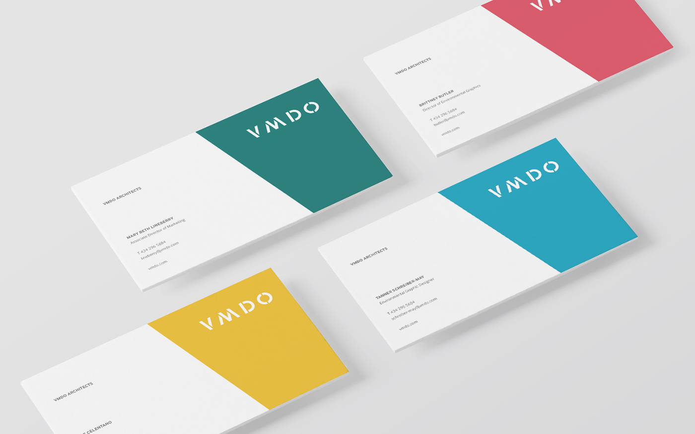
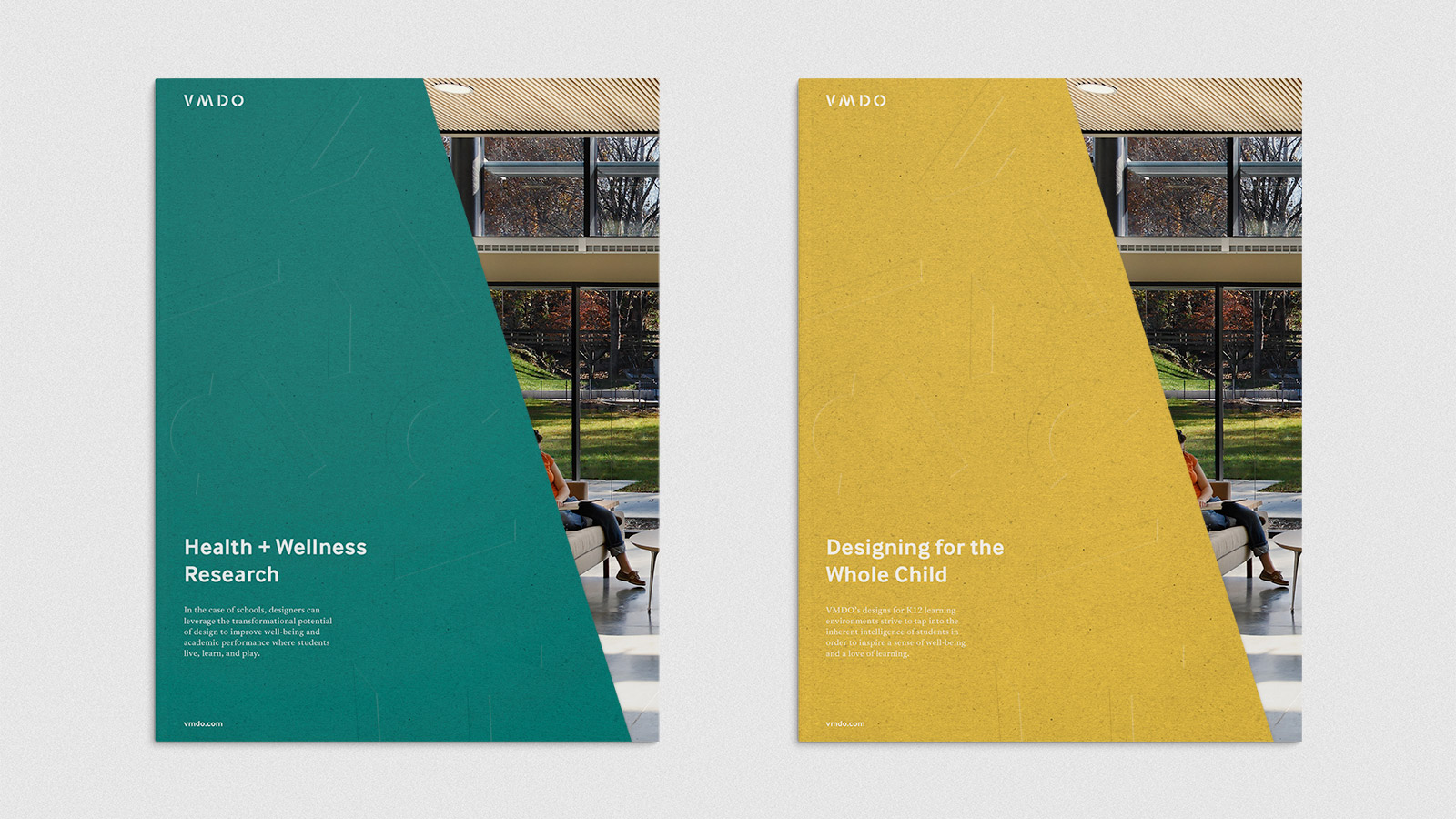
One of our many privileged partnerships was working with the incredible team at VMDO Architects. They are an architecture and design firm with an unwavering commitment to creating environments that shape the way people live, work, and play. For the last 40 years, they've been dedicated to helping institutions and communities envision pivotal projects, specifically within the world of education. Their heart for their work is extremely sincere, and that is felt in the spaces they design.
 
As they embarked on a new decade of practice, the VMDO team sought our expertise to revitalize their brand through a new visual identity, graphic design system, and improved website experience. Despite being a well-established firm with a rich history, they took a collaborative approach, eschewing micromanagement. Understanding their role and ours in designing a brand identity, the VMDO team provided the necessary information and resources, built a true relationship with our team, and trusted us to excel in our expertise: shaping their brand's future.

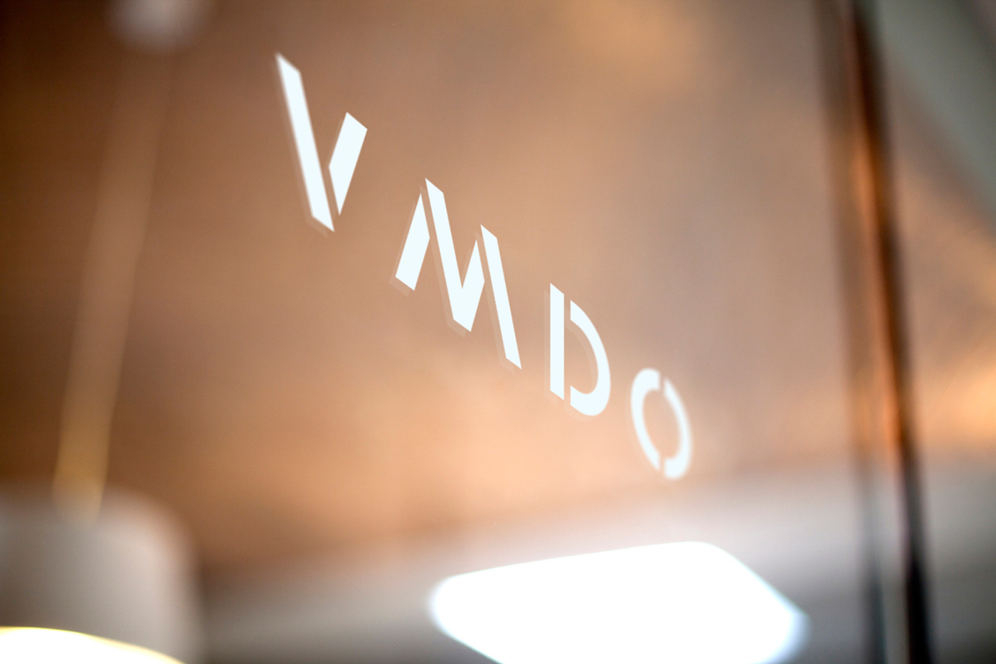
The outcome was a new visual identity and online experience that not only showcased their work but also effectively communicated the values within the work. A truly collaborative balance was achieved, the work culminated in a brand identity with long-lasting value.

Before:
VMDO Architecture Firm Rebrand - Before

After:
VMDO Architecture Firm Rebrand - After

VMDO Architecture Firm Rebrand - After

VMDO Architecture Firm Rebrand - After

View Project


Los Logos 8

The Los Logos book series is Gestalten's authoritative reference on contemporary logo design. The eighth edition looks further into the ever-changing world of this vital element of branding: the logo. We're honored to have multiple logomarks featured in this collection.... (read more)

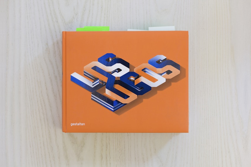
Los Logos 8: Brand Identity Design


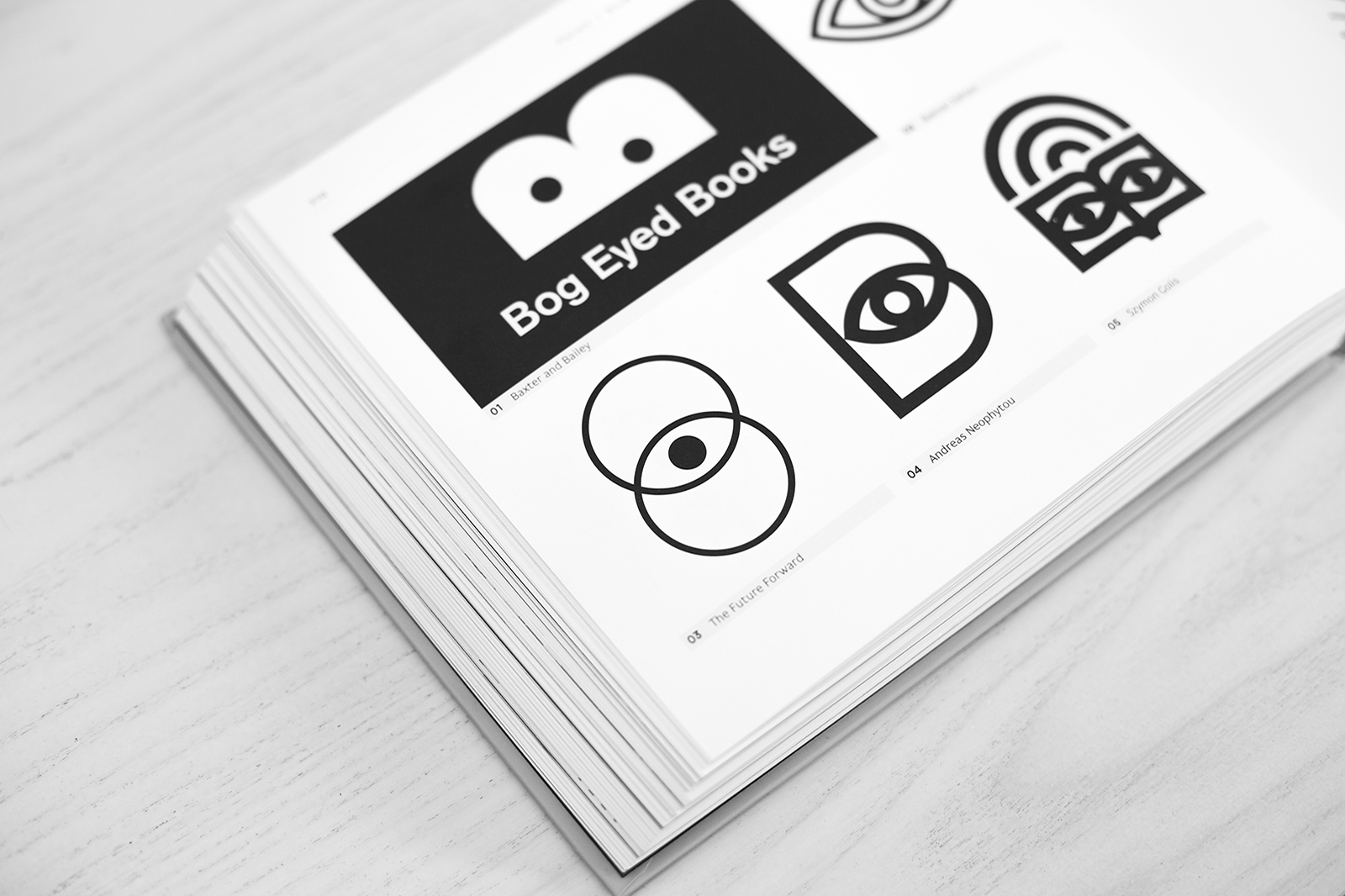
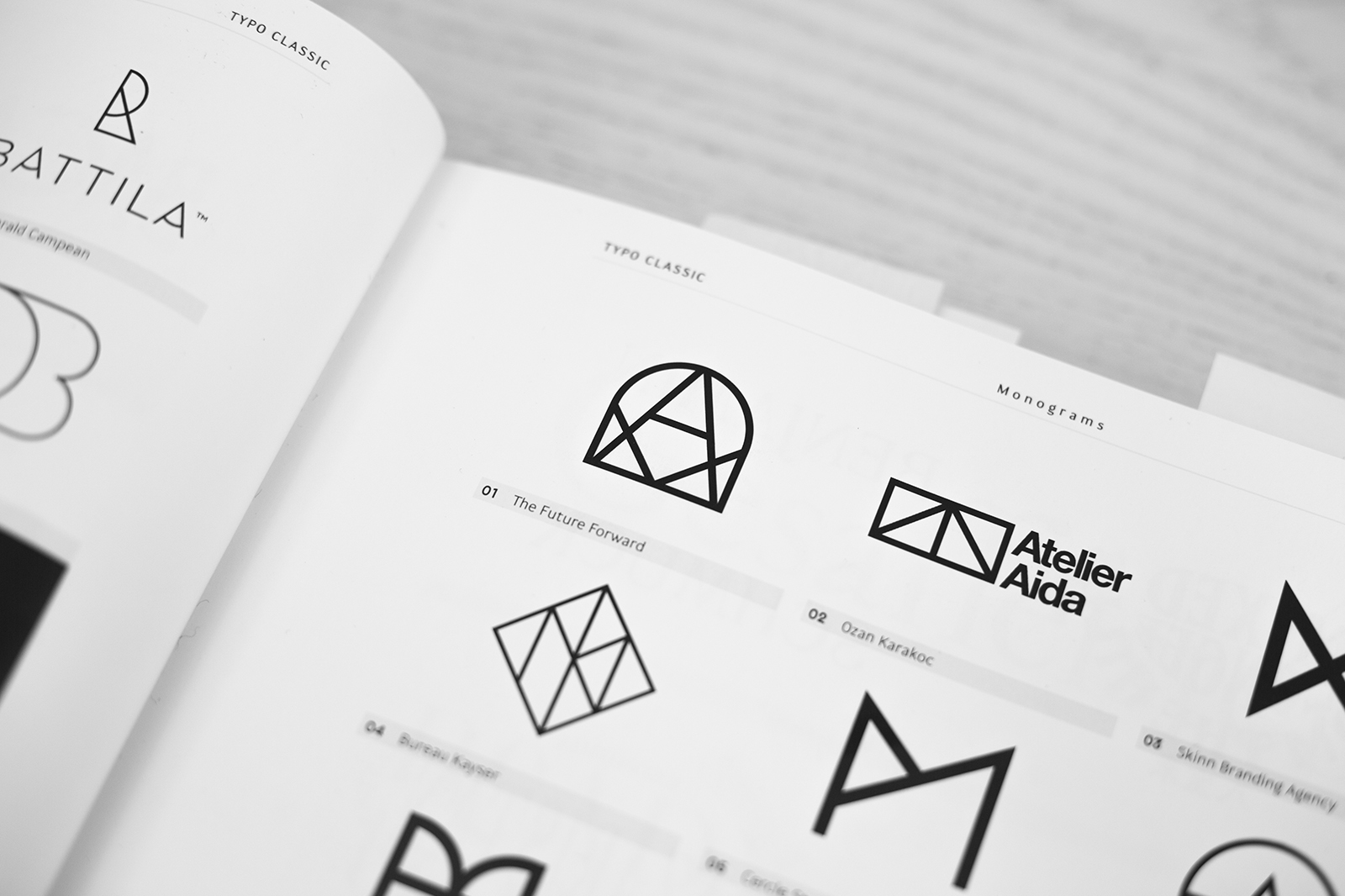
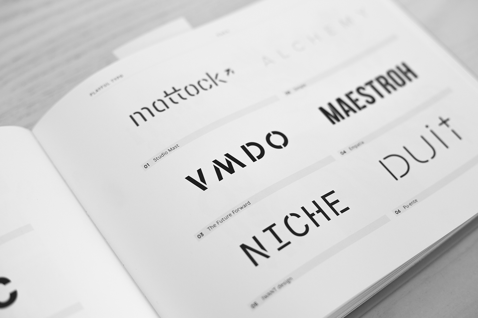
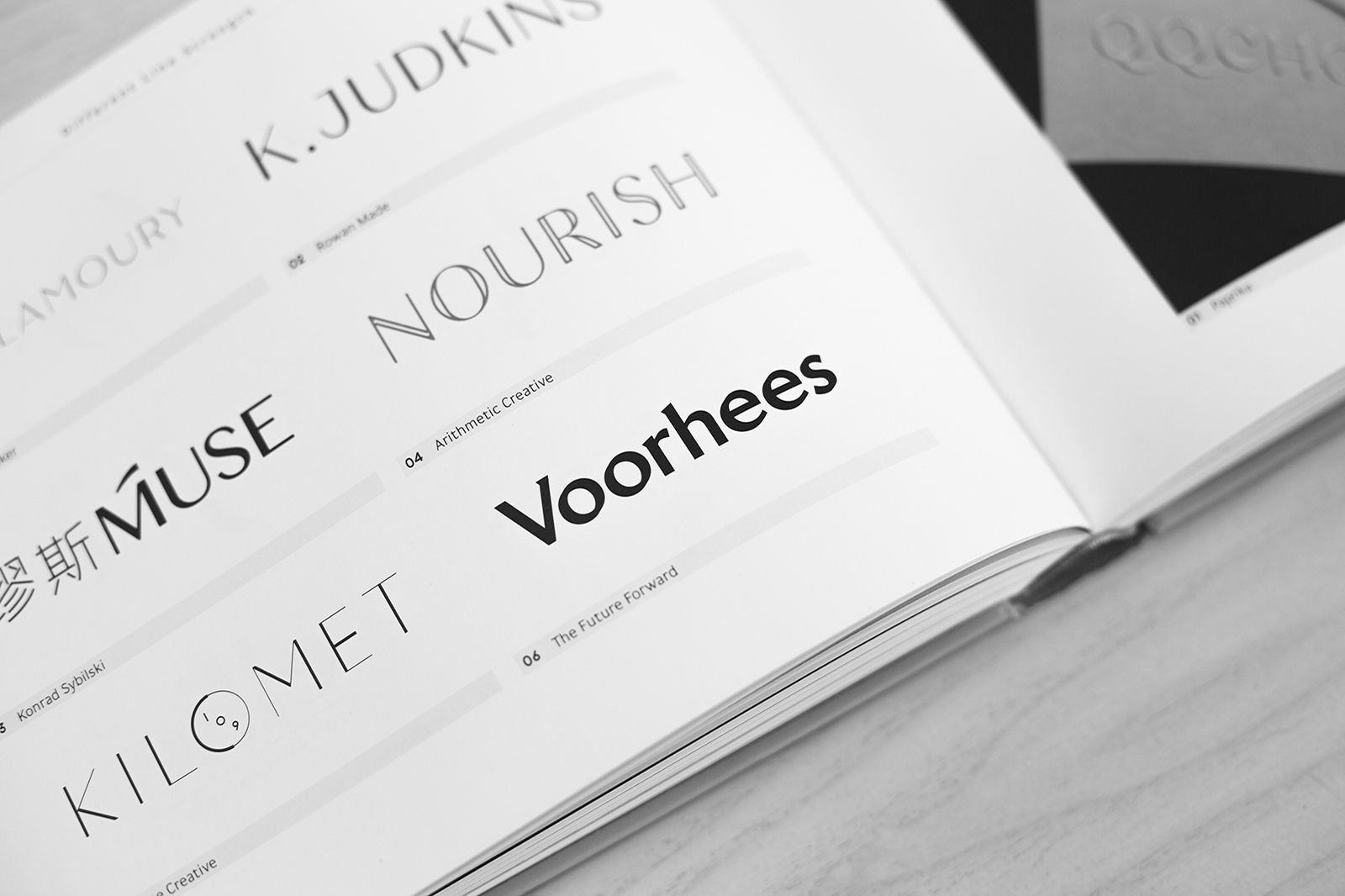
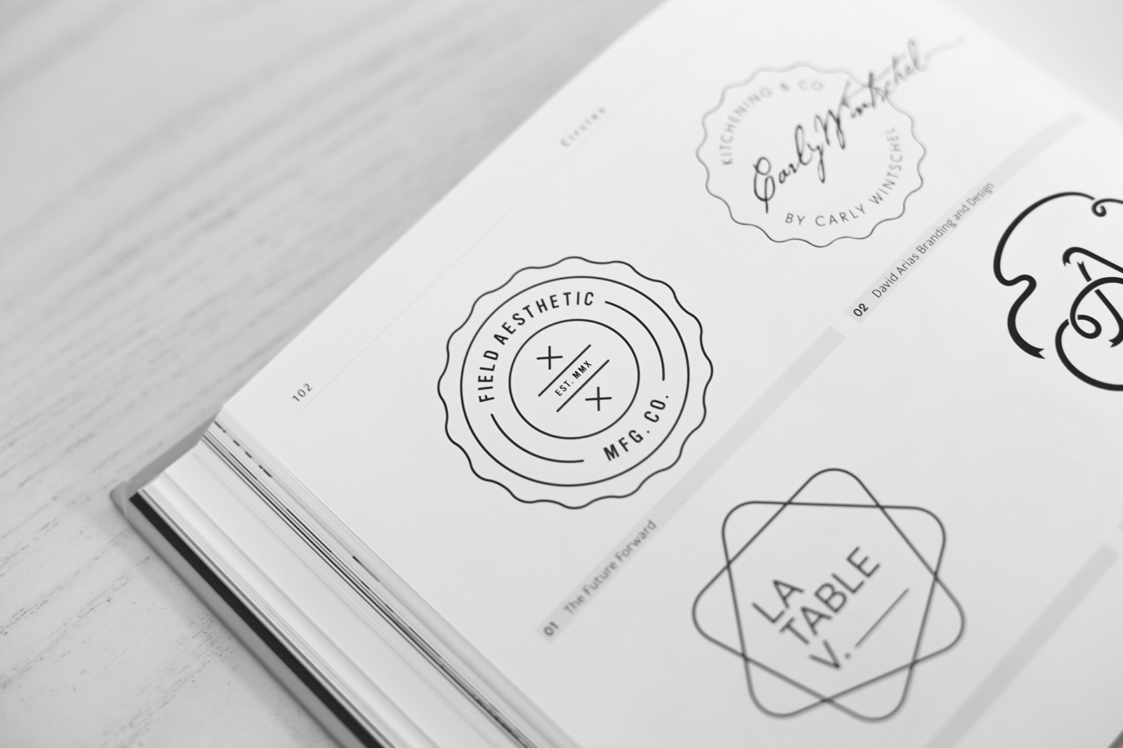
The Los Logos 8 series is Gestalten's commanding reference on contemporary logo design. The eighth edition looks further into the ever-changing world of this vital element of branding: Los logos 8 book design. We are proud to have created their brand identity design and contributed multiple logomarks featured in this prestigious collection.
 
Los Logos 8 - The Future Forward Logo Design

Los Logos 8 - Dillon Kyle Architects Logo Design

Los Logos 8 - VMDO Architects Logo Design

Los Logos 8 - Voorhees Collection Logo Design

Los Logos 8 - Field Aesthetic Logo Design

Get the book here.

Adapt or Die

11.6 billion. This is the number of mobile devices expected to be on planet earth by the year 2020. Humankind has long been outnumbered by mobile devices and that gap is only going to widen in the future —— an interesting, exciting, moderately terrifying thought in and of itself.... (read more)

Responsive mobile Web Design


11.6 billion.
 
This is the number of mobile devices expected to be on planet earth by the year 2020. Humankind has long been outnumbered by mobile devices and that gap is only going to widen in the future —— an interesting/exciting/moderately terrifying thought in and of itself.

Life doesn't offer many guarantees, but the continuing exponential growth of portable internet-connected technology is certainly one of them.

When it comes to how mobile devices are impacting websites, ZD Net confirmed that at the end of 2016 mobile and tablet web usage had officially exceeded desktop for the first time in the internet's history. And then there was "Mobilegeddon". Back in 2015 Google announced that any site that was not built in a mobile-friendly manner by employing the approach of "responsive web design" would be penalized in mobile search results (and they've held true to that statement), besides going by the best practices for responsive web design.

This ongoing evolution to how the internet is being experienced continues to confirm that the implications of mobile tech in the world of web design and the benefits of responsive web design are numerous and at the forefront of the industry. All of this may seem daunting and feel like uncharted territory, but at it's core the challenge is nothing new. Design in all its forms and examples of responsive web design always will be - centered on the goal of solving problems and making life better (not simply more beautiful).

What is responsive web design is no different. While the industry may be ever-changing, the focus remains clear: to create websites with a specific purpose and engaging experience that are easily accessible to all. The presence of thousands of different devices makes this difficult, but the key is found where it's always been: obtain a full and complete understanding of the problems and challenges at hand, and then look to solve them using our research, insights and expertise in user experience and design to guide the process.

In a time when we are presented with numerous complexities and now a rapid advancement in mobile technologies a new certainty arises: a holistic approach to digital design is vital. One that embraces these technological changes and stays on top of trends, while always putting the user first. Never sacrificing form for function (or vice versa), but instead seeing them come together to serve a cohesive purpose and accomplish the goal at hand.
8 Features to Consider in a CMS

What does a Content Management System (CMS) have in common with toothpaste? If you've ever bought a tube then you know that there are approximately 8 million options, all with different benefits, gimmicks, and promises. Selecting a CMS can feel quite similar.... (read more)

8 Features to consider in a CMS


What does a Content Management System (CMS) have in common with toothpaste? If you've ever bought a tube then you know that there are approximately eight thousand options, all with different benefits, gimmicks, and promises. Selecting a CMS can feel quite similar. So, how do you choose a platform that can do everything that's needed, but doesn't get in the way with unnecessary features? That isn't bloated with excess garbage, but is capable of delivering an intuitive experience? That is extremely secure, without the need for an in-house Nick Burns? That's easy to use, and even *gasp* enjoyable? Many may wonder, what is CMS? To ensure our clients have complete control over their sites, we integrate a Content Management System (CMS) to every website we design and develop. This brings to the next question: What is content management system used for? Over the years, we've explored various options, learning valuable lessons, and from that experience, we present 8 key content management system features to consider when selecting a CMS platform for your next project.

1. Design Freedom

As we've written about before, You Are Not a Template, so your website shouldn't be either. While the hordes of CMS solutions out there often try to entice with pre-designed templates and themes, a web platform should allow designers and developers to do what they do best: create. If a browser can do it, a web platform should be able to deliver it. So rather than hearing continual "no's" when asking for new functionality or a custom user experience, there's just a whole lot of "yes".

2. User Interface

We've trained people ranging from millennial nerds to great-grandmas, and in the process have found that an excellent user interface is beneficial for all. In the case of a CMS, the UI of the platform itself should be customizable, enabling the developer to create the best possible experience for the content being managed on a particular website. Just as design freedom is vital for the front-end, versatility is a must for the back-end. When a platform is set up to manage your specific content, it makes managing content as easy as filling out a clear and straightforward form, with no coding knowledge required.

3. Flexibility

It shouldn't matter what the end-goal of your website or web app might be — informational, interactive, publication, e-commerce, social, or any combination thereof — a great CMS should be ready for any task. This means the platform should have a robust API and object-oriented core, for total flexibility. Also, bonus points for "open source" platforms that allow access to every line of code, for complete control of your site.

4. Security

With the prolific usage of many of the platforms available today, nefarious attempts to hack these platforms have also risen. For instance, WordPress had 1,217 vulnerabilities logged in March 2017. Yes...one thousand two hundred and seventeen (source: makeuseof.com). Does this mean you should avoid Wordpress and opt instead for a more "niche" platform that doesn't have such a large target on its back? Maybe. But no matter what, security must be a high priority in the selection process.

5. No Bloat

As a developer, there's nothing more frustrating than using a CMS that attempts to provide design or functionality "out of the box" that is not needed. This often results in having to hack through bloated code just to get the desired layout in place. A "content manager" should do just that - provide a platform for managing content efficiently. Engineering a design should not be painful, and managing content should not be a confusing and laborious task.

6. Community / Support

One of the first things we look into with a given platform is the community forums and support areas. Often this comes down to the type of platform you are choosing, be it a "proprietary" platform that offers paid support, or an "open source" platform with a community of contributors and helpful supporters (our preference). But either way, any quality platform will have an active support system for you to lean on throughout the build of your website and beyond.

7. Documentation

Similar to having an active community or support system, it's important that a platform has coherent and well-organized documentation on its usage. There's nothing worse than trying to use a system that has been well designed but provides little to no instruction on its use. So look for documentation first, rather than waiting until the development phase. If the creators have taken the time to develop excellent documentation, chances are they've taken that much more time to develop a great platform.

8. Integrations

A CMS should do what it does best (content management), and then easily integrate with other systems that do what they do best (customer relationship management, order fulfillment, book-keeping, email newsletters, etc.) Too often platforms try to be everything to everyone and then fail to do much of anything well. Examples of content management systems: A good case of this would be an e-commerce platform that also attempts to be a content management system. This often results in insufficient control of the content on pages outside of the web store itself, leading to the need to learn code just to get things to look right on your About page, blog posts, etc. Avoid these scenarios like the plague. —— The list could go on, but we'll end with this: If you find yourself delaying any and all website updates due to fear of that insane-back-end-admin-thing that is supposed to help you update your website but instead haunts your dreams, feel free to say hello. Perhaps we can help you solve the problems you're having...and offer a suggestion or two on your next tube of toothpaste while we're at it.
We're using cookies to deliver you the best user experience. Learn More